Tuesday 26 April 2011

Evaluation Question 7

7. Looking back at your preliminary task, what do you feel you have learnt in the progression from it to full product?


My preliminary task was a basis for me to learn research techniques, magazine design and editing and finally, evaluation. Learning how to design the magazine has been my biggest learning curve, and I feel that this has progressed a lot since my preliminary task. The contents page in my preliminary task wasn't very good but it gave me a chance to develop a more professional looking design for my final piece. Planning and organising my coursework was helped by my preliminary magazine task. As you can see, the difference between my original preliminary task in comparison to my final piece is very different. My preliminary task was much more basic in comparison to my final project. Overall, I feel I have learnt in the progression from my preliminary task to my full product a distinct progression of the quality of my work.

Evaluation Question 6

6. What have you learnt about technologies from the process of constructing this product?

These are the following programs I have used during the duration of my media coursework:
  • Pages (Apple)
  • Adobe Photoshop CS5
  • Adobe Ideas (App)
  • iPhoto
  • Blogger.com
  • Slideshare.net
  • Scribd.com
I already had iPhoto which comes as standard on a mac, which is good for storing images on, but I needed a more advanced program in order to edit my photos on, namely for my front cover. I purchased Photoshop CS5 in order to carry out these tasks. With this program I learnt new editing skills with the help of my granddad who is a professional photographer. The magazine was edited and designed using Pages, which is Apples word processing program. Luckily I have a Macbook Air which allowed me to carry on work outside of school. Also this meant that I developed my understanding of the program which helped me with my Extended Project Qualification. I used websites to make my blog more effective when considering it is a media blog. I found different forms of media to convey my work, with websites such as SlideShare.net and Scribd.com. These different ways of presenting my work have enriched me because I have consequently been able to use these for homework's for other subjects. I used Adobe Ideas to create my flat plans. Even though they were basic, I wanted to use a new form of media to present my work, a difference from just drawing them up on paper.

Overall, all of these new forms of media I have used since my preliminary task have ended in a strong project. The end result, the magazine, has largely been a success.


Evaluation Question 5 Audience Feedback

5. How did you attract/address your audience

I addressed my target audience by asking a number of people in my target readership audience who belong to my presupposed BC1 demographic group and those who have interests in the right clothing companies and music. The biggest criticism was the front cover because it did not have enough article subheadings.

I found that both men and women alike unanimously agreed that the magazine and its design was heading the right way in trying to attract/ address my audience. On the whole, older generations liked my magazine and its purpose because of the nature of the target audience. Younger people found that they weren't so enticed because they weren't as interested in the 'lifestyle' brand of the magazine, which is what it intends to be. The idea of a lifestyle brand clearly appeals to older people who are working, so on the whole my target audience appeals to over 20's.


Evaluation Question 4

4. Who would be the audience for your media product?

I was initially in two minds about who the audience would be for my magazine. During my research stage, I decided that my target audience would range between 18-30 with a demographic of BC1. The lifestyle segmentation would be classed as the 'belongers'. These are people who are relatively wealthy, spend money on quality products, save a lot, make big purchases such as yachts and tend to crave a perfect quite family lifestyle. These people will be educated at University with arts and humanities degrees such as English, creative writing, drama etc.

Evaluation Question 3


3. What kind of media institution might describe your media product and why?

There are a number major players in the UK magazine industry. These include Emap, IPC Media, Bauer and the BBC. I think that Bauer media would describe my media product best because it publishes magazines like Kerrang! which is an alternative magazine, much like Unsigned. Bauer media owns over 80 media brands, and claims

'Bauer Media reaches over nineteen million UK adults across multiple media channels. ... Our business is built on millions of personal relationships with engaged readers and listeners. We connect audiences with compelling content, whenever, wherever, and however they want. Our unique insight allows us to work closely with our customers to develop innovative solutions that create a difference to their business.'

I think Bauer media would be a good media institution because of its sheer size, but also its ability and knowledge of alternative magazines with the likes of Kerrang!


Another choice is IPC Media which publishes 350 million magazines a year. It's vast publishing range, including Uncut, means that this media institution would be ideal for my Unsigned magazine to be published by. IPC media would be a good institution to publish Unsigned because it has already entered the music market. The only problem is that the music magazines it already publishes are based around marketing huge and established bands. This may be the cause of some problems, as the whole Unsigned USP might be defeated.

Evaluation Question 2

2. How does your media product represent particular social groups?


My targeted audience are middle class adults in their mid-twenties, with a demographic of BC1. I have created a list of reasons as to how my magazine represents my particular social group, which are as follows;

- Colour Scheme

- Pictures

- Article content

- Overall Design - font and intended adverts


Colour Scheme

Firstly, the colour scheme is gold/ bronze tint, black and red. The gold and bronze tint symbolises wealth and wellbeing, which my chosen demographic will most likely aspire to. Black depicts mystery, as well as elegance in my magazine. The mystery is there as the big question which will be going through the readers minds will be whether these bands will make it big. Elegance is primarily the reason for black; with the darkness depicting the ambiance of the night; the glamorous feel of going out in the evening, popular with middle aged middle class men and women. Red generally depicts alarm, but may in this case metaphorically describe the way in which two bands have stumbled upon each other. Red also captures peoples attention very well and is commonly used on the front cover of magazines for this very purpose.


Pictures

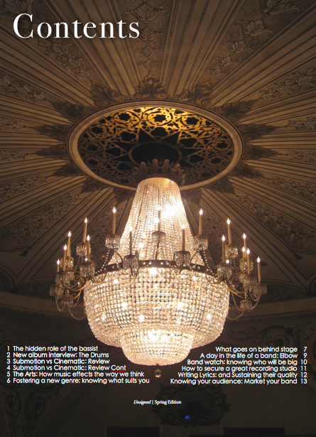
I tried to make sure the pictures I used were specifically aimed at my social audience. As well as the colours, the places and themes of the photo’s were meant to have connotations the readers could perhaps connect to. The front cover has a picture of a person wearing traditionally middle class clothing, youthful but somewhat adult like with the zip jumper. The edited in background of the front cover is a park in central Bristol, but looks to the reader like a path from somewhere in Alice in Wonderland. The picture on the contents page of the chandelier has obvious connotations of my particular social group; evenings out to the theatre are stereotypical with aspirers. Finally, the chess board and pieces on the DPS are generally associated with the middle classes by way of nature. In terms of semiotics, this may bring the reader to think of their time as a child when they might have played chess. Many private schools have chess clubs and a large proportion of the readers might have been to one before. This means the use of the chess board and pieces could create an emotional connection with the reader.


Article Content

The article content is incredibly important when choosing to represent a particular social group. I was inspired for the content of the article on the DPS from arts magazines and even movie reviews. I realised I had to simulate an article review similar to that of the Guardian, Times or Telegraph in order to represent my particular social group. This meant I used relatively high, arts related, register language, such as ‘experimenting’, ‘emotions’ , ‘underrated’ and ‘justified’. This gave the feeling of the article a theatrical feel, which connects with the ‘Cinematic Orchestra’. The use of the two seasons ‘Autumn’ and ‘Spring’ are also quite representative of my social group because the activities the group pursue change during them; e.g. kayaking in Spring and Skiing in Autumn.


Overall Design

The design of my magazine is largely developed around, and pays homage to, conventional magazines. I believe my magazine design represents my particular social group by a collaboration of the above methods, which in turn create a complete magazine aimed at my demographic of BC1. The fonts I used without doubt represent the social group of my target market. The primary font used was ‘Didot’, which I think was important in keeping with my chosen social group. Where other magazines with a similar demographic (e.g. Cosmopolitan with ABC1) have used a similar font, I have followed, because the semiotics of the font automatically show that the magazine must be aimed at people within the top social groups, such as aspirers and ABC1. The Adverts I would have intended to have in my magazine would have included those such as Ralph Lauren and Rolex which are systematically aimed at my social group. They will most likely own or have an interest in brands like these already.

Evaluation Question 1

1. In what way does your media product use, develop or challenge forms of conventions of real media products?


To start, I decided to use lowercase writing on my front cover. I have read that every magazine without question has uppercase font for the majority of the cover. I decided to use lowercase font to symbolise the beginnings of the ‘unsigned’ bands. Apart from my article showing a famous band in collaboration with a new band, the vast majority of people in my magazine aren’t famous (Hence the symbolisation of lowercase letters - that in a sense, the bands featured haven’t achieved stardom yet). This could be considered a development in the form of conventions, instead of challenging them. As well as this, the addition of drop shadow to the various headings makes them look effective. What I later noticed was that the article subheadings look like they are traveling into the distance into the background, following the path which steers off to the left. The effect of this could perhaps give the reader the impression that the artist is following the light at the end of the path to becoming famous. The lower case font looks the part in accordance to the target audience. Magazines such as Cosmopolitan use a vast amount of lowercase words on their front cover, which, in the right font, can look sophisticated. However, I possibly should have put ‘Autumn Review’ on the front cover in capitals to attract a readers attention more solidly.


I didn’t use the space in the contents for an editors note. I thought that the wording placed in correspondence with the picture of the chandelier worked very well. The top of the page needed to be left alone in order for the dramatic picture to have maximum effect. I didn’t use many article subtitles in comparison to other magazines (e.g. NME) because I wanted to create a more handbook feel to the magazine. That is to say, without losing the feel of an industrial magazine altogether. The way in which I haven’t challenged a form of media is that the general layout of the whole magazine still looks like a conventional once; with some classic pieces changed around (e.g. with lower case font).

Evaluation.


This post separates the planning, research, development and final pieces with the evaluation. The evaluation will be partly made up of the following questions:
  1. In what way does your media product use, develop or challenge forms of conventions of real media products?
  2. How does your media product represent particular social groups?
  3. What kind of media institution might describe your media product and why?
  4. Who would be the audience for your media product?
  5. How did you attract/address your audience
  6. What have you learnt about technologies from the process of constructing this product?
  7. Looking back at your preliminary task, what do you feel you have learnt in the progression from it to full product?

iPad Rival: Sony S1 and S2 *AND New Technology*

Sony have officially announced they will finally be entering the touch screen tablet market. The Telegraph has said that Sony is to 'challenge Apple with two tablet computers'; one of which will be a similar shape to conventional tablets, but the other will be a clamshell design with two screens (like the Nintendo DS). I think that there is a possibility that Sony will be able to reach its aim of being 'second to Apple in the tablet market by 2012' because they have a substantial customer base already. Also, they plan to incorporate Sony Playstation into the device, ebooks from their Sony Reader store and 'music and film streaming service, called Qriocity.' Notably, the device will also use Android, which already dominates Apple OS mobile systems in terms of the amount of users. All of these different killer features mean that Sony could well be on the ball for being a genuine Apple rival in the tablet market. That is to say, the first.


The ultimate killer app for Sony would be to make these devices cheaper - people in the west trust Sony and they have done for years, so will people decide to buy these over the new tablet empire Apple have built upon (new) reputation?


UPDATE (5/05/11):


It has been announced that a Canadian technology firm has designed a 1mm thin touch screen device, called 'PaperPhone', currently based on the same ink screen technology as the Kindle. Here is a video explaining the new product, which apparently bends like a piece of paper and is designed to be able to fold into the users pocket.


Monday 25 April 2011

Immersion Theory


This article of an interview with Frank Rose by CNET, describes how any new media device takes a very long time for people to fully understand and actually use in a main stream way.
'One of the key things I came to realize is that it takes people 20 to 30 years to figure out what to do with any new communications technology. The motion picture camera was invented around 1890, and it was 1910 before they even came up with the idea of movie stars, and another 17 years after that before they had sound.'
He goes on to say that the same thing happened with the television, which of course is one of the most important media d
evices in almost every single human beings lives in the westernhemisphere; soon to include the East.
iPad
I believe we can connect this theory with the idea that the introduction of touch screen media devices like the iPad by Apple will wipe out books and newspapers. To date (April 2011), Apple has sold 15 million iPads (Source - nbbusinessjournal) over the period of one year. The reality so far is, (for the sake of argument, one person has an iPad each out of the total sold) that 15 million people accounts for little over 20% of the UK on its own, let alone the 6.5 billion others on the planet. That said, hedge-fund manager Jeff Matthews predicted that in a few years, Apple will soon be selling up to 50 million iPads a year. This then, bases solely on just the estimates based around Apples products and sales predictions alone, looks like Frank Rose's theory could be right. A crude sum based on the claim by Matthews says that in 30 years, (ignoring the fact new technology will exist by then) there could well be in the region of 1.5 billion iPad successors in the world. Perhaps then, in 30 years time we will see a reduction or even a complete stop in the use of magazines, books and newspapers.

Book sales fell in the years 2007 to 2008 by 1.5%, according to NYTimes, which doesn't show a drastic decrease, as this could simply show the natural trend in the growing populations of people who can't read, or that people are simply uninterested in books because of other distractions. On the other hand, GizmoCrave report that there has been a 208% in February 2011, which looks set to rise. But for now, people are quite content with physical media devices such as a newspaper. The way they feel and handle as well as a long standing presence in our lives are still inherent in us and many people will find it hard to change the way they view the media. As well as this, there are also various health hazards holding a heavier gadget. The UK government is also under fire to change pupils reading habits at school, and should encourage students to read more books.

I think my magazine would be suited to entering the iPad/ Android app market. With many mainstream magazines such as GQ designing iPad based magazine editions, a music magazine could work very well. As long as the iPad is connected via WiFi or 3G, the magazine could stream music straight from the page for the readers to listen to. This sort of technology could be brilliant in the future for marketing new bands.

Thursday 21 April 2011

The Art of Immersion by Frank Rose


'The Art of Immersion: How the Digital Generation is Remaking Hollywood, Madison Avenue and the Way We Tell Stories: Entertainment in a Connected World'. The FeelGuide website neatly sums it up. The book is an
'exploration of how electronic media is shattering the conventions of storytelling that have remained untouched for thousands of years.'
It is literally about how storytelling is being changed at an incredible rate through the medium of new technology. E-readers like the Kindle and iPad have changed many people's book reading patterns. At the end of each book you can buy the next in the series, there are moving pictures, pictures that move according to your hand movements and crucially, there is no need to visit a bookshop. You quite simply just have to press 'buy'. I believe that currently, peoples concentration levels are lower on e-readers. This means more and more people may not read full books as much. Visual movements and sounds may increase and in turn, decrease the literacy levels of people.

My magazine is orientated around modern technology, and will rely on viral marketing on the web to gain new readers. This will be done using Facebook, Twitter and the like, which are free forms of social media but have a colossal user base (In 2011 - Facebook had 500 million users). I would assume the magazine would eventually create a magazine app for the iPad and other media devices to keep with the times. As well as this, songs and videos can be played directly on the magazine app which cannot be done on paper. This is how my magazine can connect with Frank Rose's 'Immersion', in that it will capture new ways for people to read stories - the difference being, my stories will be articles about new bands whilst streaming music and videos at the same time. Not forgetting, direct links to purchase a new album, EP, single or song. These are all forms of convergence, where multiple different media devices connect together in accordance with each other.


Predictions for Connected Devices in 2011


Mashable haswritten an article predicting which media devices will make their inaugural appearances in 2011 and what will generally still be popular. It has short listed four things. The importance of the screen, the use of devices in bed, in cars and interestingly that people will still be as glued to their sofas watching TV as they did ten years ago. Essentially, the most important media form which will without doubt take off formally in 2011 is connectivity. This is the idea that different media devices can be connected together to co-operate. This is already in play with the Apple TV, which connects the consumers computer (iTunes contents) with their TV and they can stream films, music and photos onto it. As well as this, other companies are looking to connect people even faster. For example, Virgin is reported to have begun trialling the worlds fastest cable broadband.

The key new range of connective products are white goods such asFridges. Samsung have designed a 'Smart Fridge' which has an 8 inch LCD touchscreen display. There is built in WiFi which allows the user to connect to Twitter or Facebook, and enables people to replace messy sticky notes with the word pad tool. It is the 'Seamless connectivity' that is the most important thing, and is a way into the new movement called 'convergence', allowed by wireless connectivity:

'The RF4289 represents the major appliance piece of Samsung’s new Nth-Screen strategy, which stresses “seamless connectivity” and content sharing across “limitless screens” both in and outside the home. The only fly in that ointment that we can see is that, thus far no devices other than other Samsung ones support this.'


But, at $3,500, people may need a bit of convincing before they decide to buy one.

New Generations of Media Devices

This article by the Telegraph online goes somewhere to describe the future of the new, more powerful generation of portable media devices that will be shaped by processors. Mobile companies like Motorola are looking at making their devices more powerful, perhaps comparable to the slightly larger iPad
and with the processing power of a computer. On the other hand, software developer Microsoft wants to make a 'beautiful' design for the PC, which should in theory go hand in hand with mobile companies, such as Motorola. Microsoft has a long way to go, however. According to the Telegraph, the Gartner report found that Google's Android reached a 25.5% share in the market in 2010, putting it in second place behind Symbian; used by Nokia smartphones. Ultimately, though, with the increasing use of internet cloud storage software, peoples needs for a high-spec PC are loosening. Instead, the general direction for media devices seems, to me at least, to be going more towards smaller, nifty devices which communicate with others around the house. In short, a universal remote.


Thursday 14 April 2011

Final and Improved: Magazine

Front Cover:


Contents Page:


Double Page Spread:


Critique: Double Page Spread

I was pleased with the way the DPS came out, except there was one major floor - the middle of the page. This is why I am going to discuss the critique first.

Critique
Steve Priddell and Rowland Cowley said the following;
  1. There is no fold line in the middle. In other words, half of the words will be unreadable and the title will be cut. It looks great, but you need to change the design so there is no overlapping in the middle of the page
  2. Watch out for page margins again (the page '4' number had been cut off)
  3. Make the black chess piece bigger
  4. Make the picture of me bigger, so the body is a predominant feature of the page
  5. Give the heading, chess pieces and photo of the body a drop shadow effect
  6. Another picture is needed


Essentially, I needed to make sure there was a split in the middle of the page, as currently the words in the third paragraph would be chopped out. I also realised that I needed to fill the page more. The title wasn't very effective, so I needed to change that (See 'Double Page Spread: Theme' post for the new title). The title font I used was 'Didot' again, in keeping with the theme and font cover of the magazine. I used a chess board for the background, which I made 90% transparent to make the writing and pictures more clear. Also, I put three pictures of chess pieces on the DPS. Steve Priddell told me I should make the black one look bigger as a statement piece. I put the page numbers '3' and '4' on the bottom left and right of each page, although the four was just chopped off when printed. Also, I put 'Unsigned | Submotion vs Cinematic' at the bottom of the page, to make it look more professional; like I did with the contents page, but with the name of the article instead of 'Spring Edition'. For my final piece I will include another picture as advised, but I also need to depict the other lead member of the duo.

Critique: Contents

The idea behind my contents page spawned from the target audience. Middle class readers from the predominant age of 25 + will read the magazine, so I believe this photo suitably fits the lifestyle of the reader. I took the photo inside Bristol Hippodrome, and it came out very well which I was really pleased by. When the image is blown up, it looks fantastic and really looks good as a backdrop for my contents page. I struggled on how to write 'Contents', but in the end I settled on 'Bodoni StvyTwo ICT TT' font in size 64. I added drop shadow to make it look clearer. For the actual page contents I decided to write them symmetrically, which I thought justified the elegance of the picture. The font I used for the contents was 'Heiti SC', which is contemporary and fits in well with the theme of the magazine. The colour scheme may be highlighted here, with the golden, sepia look which symbolises wealth, and black which symbolises - in this case - mystery and elegance. I added 'Unsigned | Spring Edition' to the bottom of the magazine to make it look more professional, as if it were real. However, when printed this part was cut off, so I needed to move the page around.

Critique
Steve Priddell and Rowland Cowley said the following;
  1. Again, look at the page margins, move the whole image and writing up. Don't worry about losing some of the ceiling, it wont effect the dramatic atmosphere of the picture
  2. Make every line of contents belong to one page (the second one down had page 2-3), which ruins the symmetry and the order of the design

Critique: Front Cover

I felt the front cover went well, with the editing of the picture of me onto the autumnal trees having gone well. I wasn't so sure with the rest of the design, the masthead was at the bottom and the barcode left no space for a price. For the article subheadings I decided to put simply 'Autumn Review' and 'Submotion vs Cinematic'. This kept in keeping with the 'handbook' style of magazine I wanted to create, which isn't intended to advertise every single page of contents like a fashion magazine would. I have no problems with the background photo but I know I need to make changes with the overall design of the cover. After having printed it onto glossy paper for the critique showing, it turned out that the writing didn't come out so well. Also, the barcode - which is a font from dafont.com, called 'Barcode Font' came out too bold when printed, because I had to print it as a PDF file through a different MAC. The font I used for the masthead was 'Didot'. I like the simplicity of it, but it is also slightly old fashioned as well as contemporary. I used the same font for the article subheadings as well, in keeping with the design.

Critique
Steve Priddell and Rowland Cowley said the following;
  1. Make sure you don't let any of the magazine get cut by the page margins when printed.
  2. Give the subheadings a drop shadow effect to make them show up more
  3. Move the background up to leave more space for the barcode, pricing etc
  4. Move the masthead to the top, there is plenty of space for it. This is because in a newsagents the masthead would be cut off because it's slotted into a shelf, it needs to be at the top otherwise no one will see it's name

Critique with print professionals Steve Priddell and Rowland Cowley

On wednesday 6th April, print professionals Steve Priddell and Rowland Cowley from the UWE (University of the West of England) marketing and communications department. The two professional were from brand and graphic design and the print and design division and were invited to criticise our work, so we could make improvements. This day was very useful for me, having two professionals eyes looking at my work for the first time to tell me what worked and what didn't work. Improvements I could have made are going to be discussed in the following three blog posts.


Double Page Spread: Theme

This is a powerpoint I made describing the theme and colour scheme of the magazine. I used the website SlideShare as a different form of media to present the theme.


Final Photos


These are my final pictures which I am going to use in my magazine. I added sepia effect to the following two photos as it went along with the ongoing rustic theme which goes on throughout the magazine.


This is a photo of a chandelier inside Bristol Hippodrome. I really liked the high quality of the photo which looks excellent when it's blown up onto A4 size. The use of this photo represents the higher social class of the audience of my magazine, whereas it is also melodramatic, especially for a contents page.


For my final photo I decided to take a photo of my friend Andy and use the magic wand tool on photoshop to cut out the background, to which I applied his face to the double page spread. I liked the way the photo is evidently a pose, which without doubt suits the music style of magazine. Along with myself, the picture of Andy will be used to represent the band members of Submotion Orchestra and Cinematic Orchestra; Tommy Evans and Jason Swinscoe.